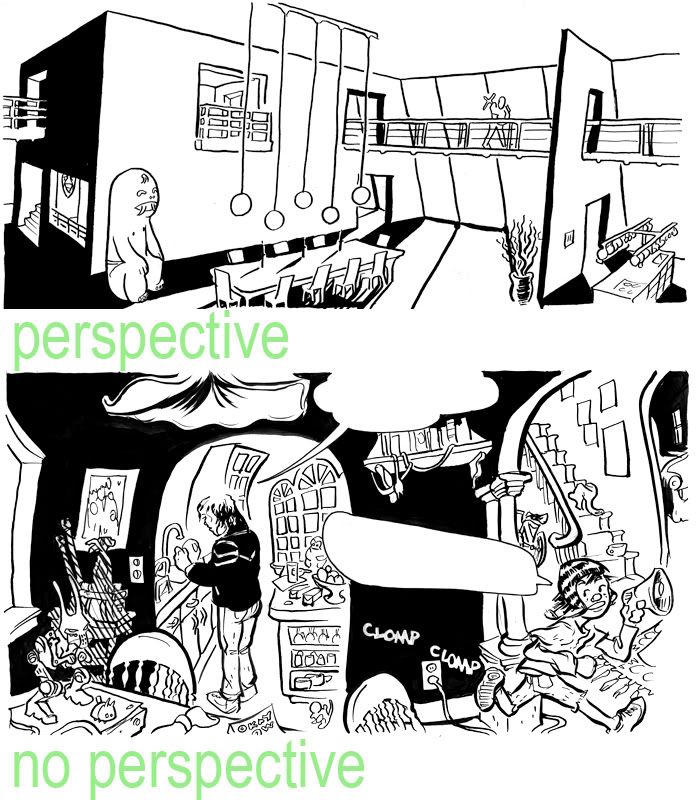
Recently I've been debating whether or not to use "correct" perspective in my comics. I like how precise and deep it looks, but sometimes it's less limiting and more organic-looking to just wing it. These panels are from the second chapter of Eighth Grade.

2 comments:
I love them both. It's very difficult to pick a favorite. Without perspective, it looks a lot more like a funhouse mirror, and with perspective the entire feel of the space looks somehow bigger. I think that with perspective looks a bit colder, too, although that may just be the house this scene takes place in. In any case, I'm really excited to see both these panels, and they build anticipation for the culminating work to come!
Thanks, you.
Post a Comment